


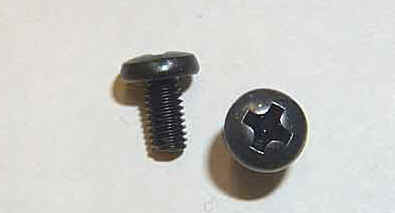
 But the copying doesn't end there. It seems that the Xbox 360 logo is, itself, a copy -- a copy of the Phillips screw.
Of course, it's not surprising to see Xerox borrow the design for its new logo. Xerox is, after all, a copier company.


 But the copying doesn't end there. It seems that the Xbox 360 logo is, itself, a copy -- a copy of the Phillips screw.
 © 2010 Personal Picture Show LLC | Box 3271 Tulsa, Ok 74101-3271 | Toll Free Voicemail/Fax: 1-888-333-8985 | Questions [at] esh [dot] mobi
« Home