
DC gets a new logo: It's a trap!
Meet the new turd, same as the old turd
Here's the part I hate. I was flipping through the ol' internet today and discovered that DC Comics has introduced a new logo for itself. And everybody knows you can't introduce a new logo for your company without the self-lauditory verbiage that goes along with it.

Everybody at the company is breaking their arm patting themselves on the back for the new logo. Here are some comments from the obligatory press release:
"The new DC logo is a mark that leverages over 80 years of heritage with an eye toward the future.
“'...the new logo has the character and strength to stand proudly alongside DC’s iconic symbols,' stated Amit Desai, DC Entertainment Senior Vice President of Marketing and Global Franchise Management. 'The launch of the new logo is the perfect tribute to DC’s legacy, exciting future and most importantly, our fans.'"
Geoff Johns, DC Entertainment’s chief creative officer, says in the press release, “To me, Rebirth and the new DC logo are built on what’s come before while looking to what will come tomorrow. I can’t wait for people to see it on the cover.”
And I'll bet if you asked either of them, they would tell you how much the new logo is better than the old "peeled sticker" logo that DC has been using since the introduction of The New 52.
Well it is -- and it's not. Companies all over have been extolling their new logos and how much better they are than their old logos since the whole concept of branding was introduced at the end of the 19th century.
It seems that truly great logos never change, or never change much. Coca-Cola has withstood the times very well. There's Johnson & Johnson as well, and while Ford Motor Company has occasionally moved away from its Spencerian script logo, it always seems to come back.
Other companies, like Pepsi, can't seem to find a logo it really likes, and changes them like sheets on a bed.
And every stinking time companies change their logo, they try to portray just how much better suited they are with the new thing.
The problem I have with this? Every time they change logos, they have to put out a press release inferring that their new mark is sooooooooo much better than the old one. The problem, of course, is that's what they did when they brought out the logo before.
The new logo inevitably always makes their old logo look like crap, and they're glad to say so. Well if their old logo was such crap, why did they bring out that turd in the first place? And just how long will this new logo be out there before it turns into a turd as well?
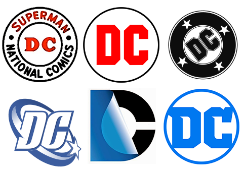
DC, of course, has a big problem in creating a mark for itself in the first place. There's not much you can do with two letters to make them distinctive. The letters D and C just kind of lay there. If it were a word, you could hit them with Spencerian script and connect the letters, but that's not easily accomplished with two capital letters, so the logo has to end up looking like a Stop sign.
Although the company publishing the Superman and Batman comics went by various names with the word "National" in them until 1977, they've been using a "DC" logo on the cover in a variety of forms since about 1940. And they are destined to tinker with the thing every few years from now on.
All that I ask is that the next logo change just be a quiet one. One in which they don't promote the new one by disparaging the previous one.
Meet the new turd, same as the old turd.
-- André Hinds ("Evermore") is the audio producer of the ElectricSistaHood podcast, editor of ESH News and writes frequently about comic books